Brand
Explore our brand foundation and visual elements below
Name
Less is the name we use for both our company and product.
Origins
Choosing Less.
When choosing our brand name, we wanted a relatively simple, one or two syllables word, an affordable domain, and, most importantly, a word that reflected our mission.
As we came across Less, we knew we found something special. Less is the embodiment of what we want to build within data analytics. It is in opposition to 10 years of tool fragmentation of analytics. It is in contrast to overcomplicated processes in which 10 different people have to be involved before spinning up a database. Finally, it reflects our approach to building Less. We want to remove the clutter and be in contrast to the many analytics tools that feels like using Windows 200. In sum, less complexity - whether technical or human - and more focus on creating cool things with data.
We ended up buying the domain minutes after coming across Less.
Logotype
When space permits, please use our logotype.


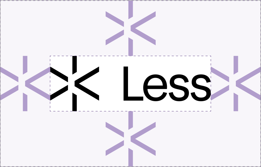
Logo
Introducing "The Spark".
"The Spark" is more than just our logo—it's what we stand for. It symbolizes how we enable doers to get going, like the spark that ignites action. It also represents those moments of insight that lead to big ideas, all while reminding us of our goal to do more with less, as shown by the < symbol within it.


Colors
We utilize a range of shades but the six colors below form the foundation of our color palette.
#191919
Black
#FAF8F6
Off-White
#FAF8F6
Emerald
#0062AD
Blue
#844B32
Sienna
#5C4080
Violet
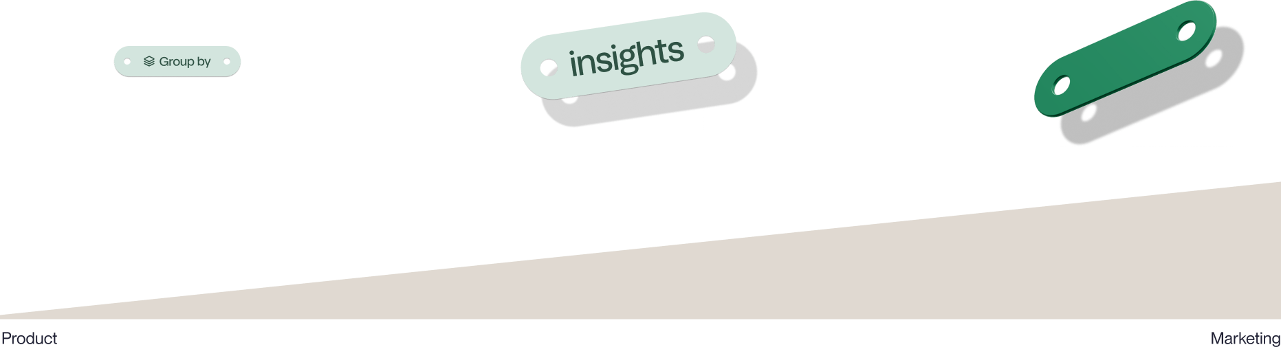
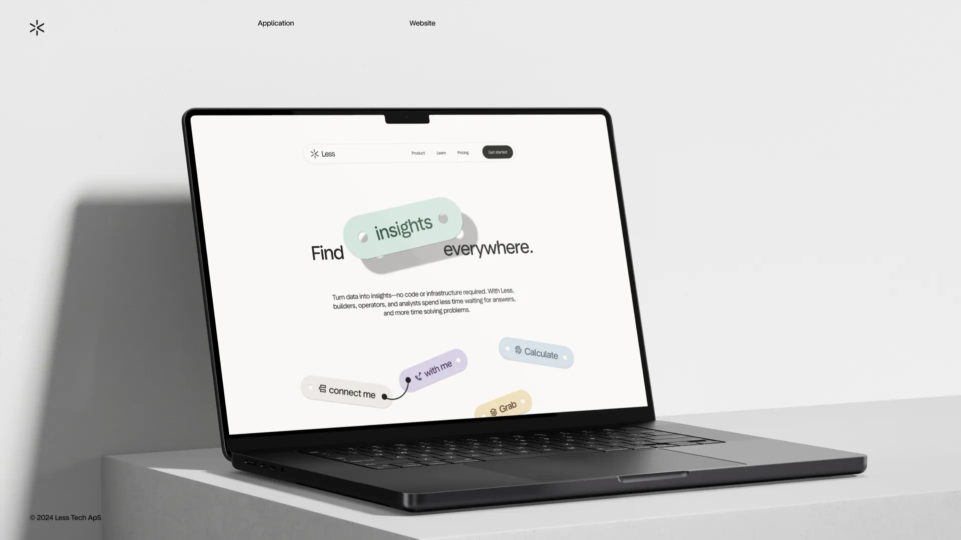
The Tool
Our main graphic device.
The Tool is a central part of our product and brand. It is the visual element that our users use to connect their data results on the Less Canvas.
In our communication the tool is used to highlight certain words or features, mimicking the interaction pattern of the product.