The motivation
The cost of building software is decreasing. New tools like GitHub Copilot means increased efficiency and output from a growing number of developers. The result is that almost any vertical becomes increasingly competitive.
We believe design is and will increasingly become a strategic lever for startups to distinguish themselves from the crowd. It used to be an afterthought for most enterprise software, but today, some of the most successful new startups, have integrated design as a core part of their company. Linear, Raycast, Liveblocks, Amie, Resend to mention a few. It has even sparked the creation of a brand new role - Design Engineer.
And to achieve that goal, design has to be a core part of how we build Less.
The old brand
When we created Less, we focused on functionality and threw together a design that kind of worked. Many of the companies we looked up to utilised gradients and we dived in at the deep end. One of the primary reasons we built the website was that we needed public Privacy Policy and Terms of Use for our OAuth integrations…
Once we got some traction, we rebuilt our website. Still gradients, but slightly more sophisticated.
By the end of 2023, we reached our revenue targets and decided that the timing was right to rethink our entire brand. This time, we wanted to partner with someone more talented than us.
The partner
When we met David from G-W Studio we knew we had found that right match.
We had three critera when selecting a design partner - G-W ticked all three.
- Our roots are Scandinavian and we wanted a partner that embraced that.
- We were looking for a partner where the people we met during the honeymoon phase would also be the ones building our new brand.
- We wanted to transition from talking about product features to storytelling. G-W excels in brand foundation and copywriting, which was rare for the type of design agency we were looking for.
Our collaboration with G-W has been beyond what we’ve hoped for. Their commitment to Scandinavian design, focus on functionality, and desire to reduce complexity fit perfectly with our ambitions.
The foundation
Our process began by crafting a verbal, brand foundation. As a horizontal data analytics tool (a tool that can be used to work with any type of data source), one of our challenges has been communicating our message clearly. We set out to change that with the brand foundation.
We interviewed many of our users and customers to understand why they’re using Less. It quickly stood out to us that our users are problem-solvers. They have a inherent drive to find answers, create insights and automate legacy processes. And they hate being dependent on other people to do that. They are doers.
That key message became the common denominator throughout our positioning, mission, brand values, etc. One of our favourite items from the brand foundation is our new manifest that you can read on our About page.
The visual direction
From the get-go, we had certain restrictions for the visual direction:
- Our name - Less - comes with certain restrictions. Going guns blazing with a visually busy design didn’t feel right.
- We’re a Scandinavian company. Our visual identity had to reflect that.
- As a new and relatively unknown startup, we must create something memorable and recognisable.
We think G-W brilliantly navigated those rather difficult restrictions. When we saw the first mockups of what became our visual identity, it instinctively felt right.
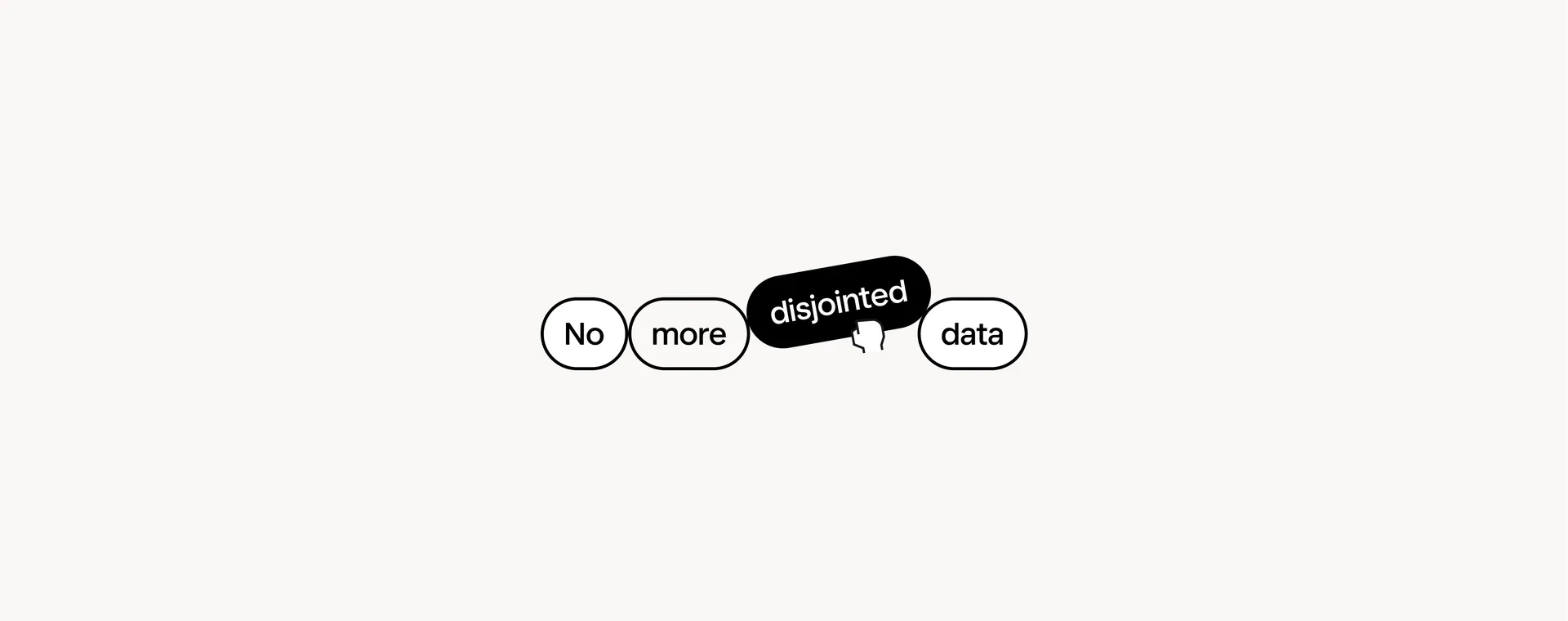
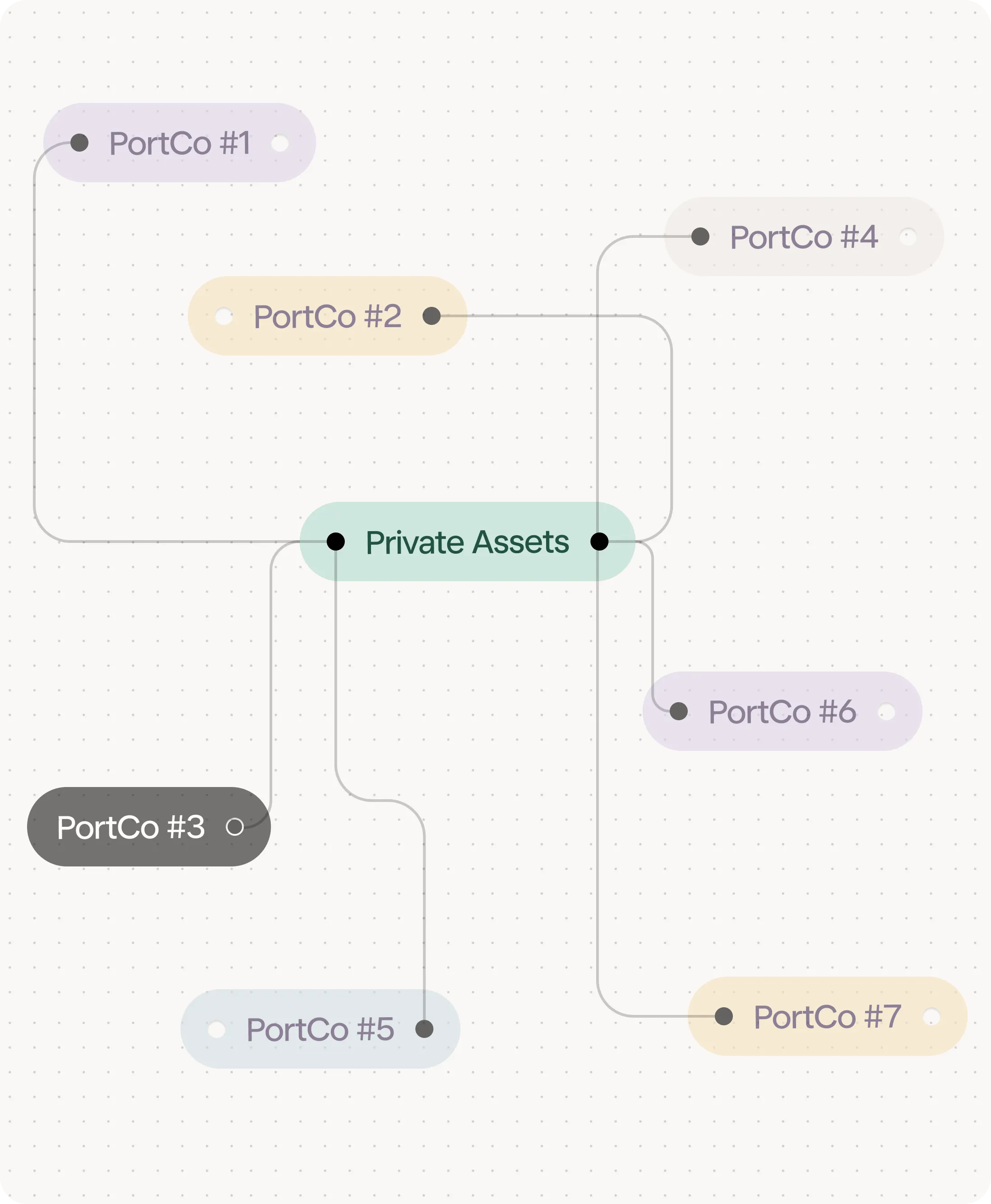
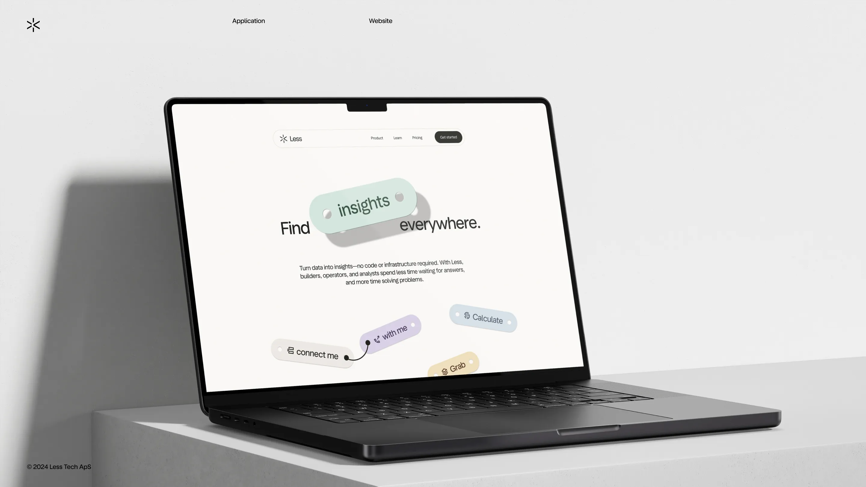
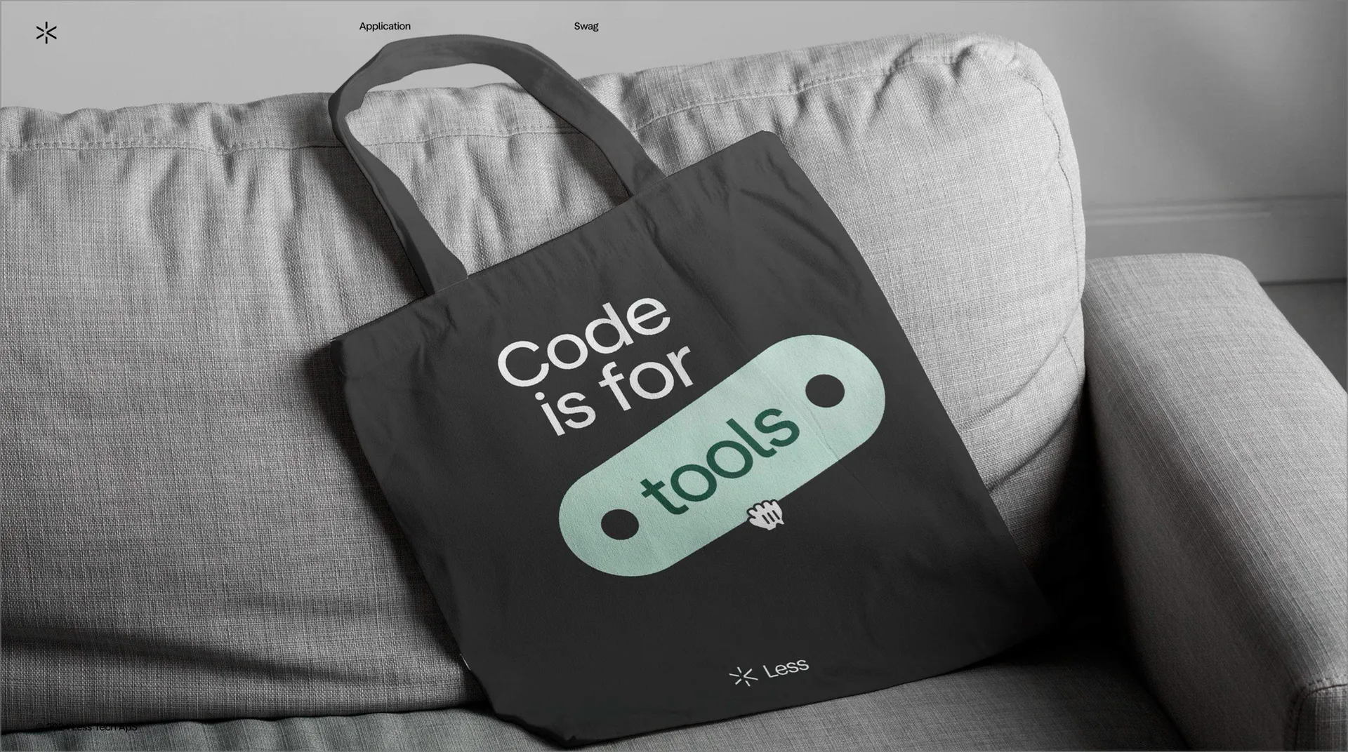
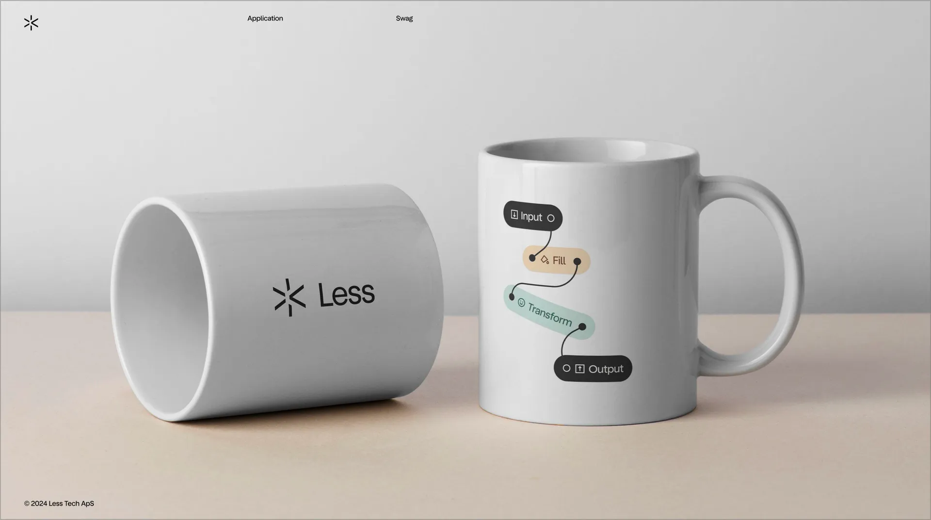
G-W crafted a very product-focused visual identity where the tools our users use to build models on the canvas are front and centre.
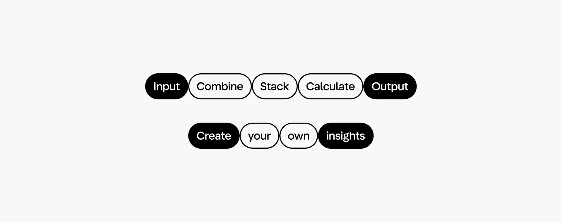
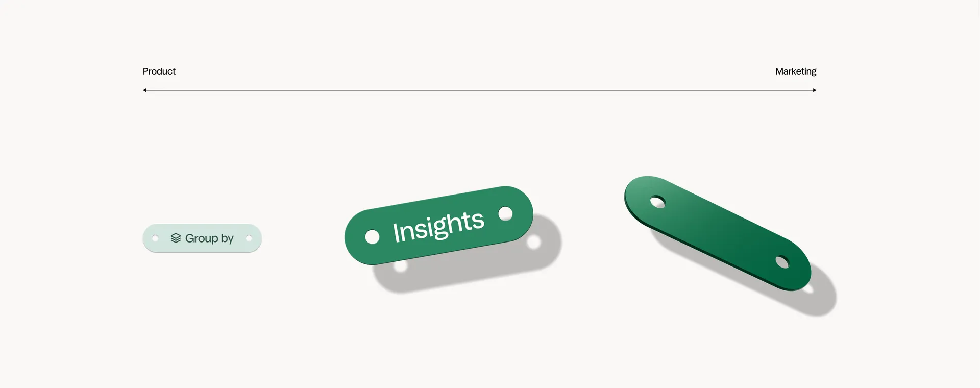
We loved this approach because the visual identity became a representation of our brand foundation.
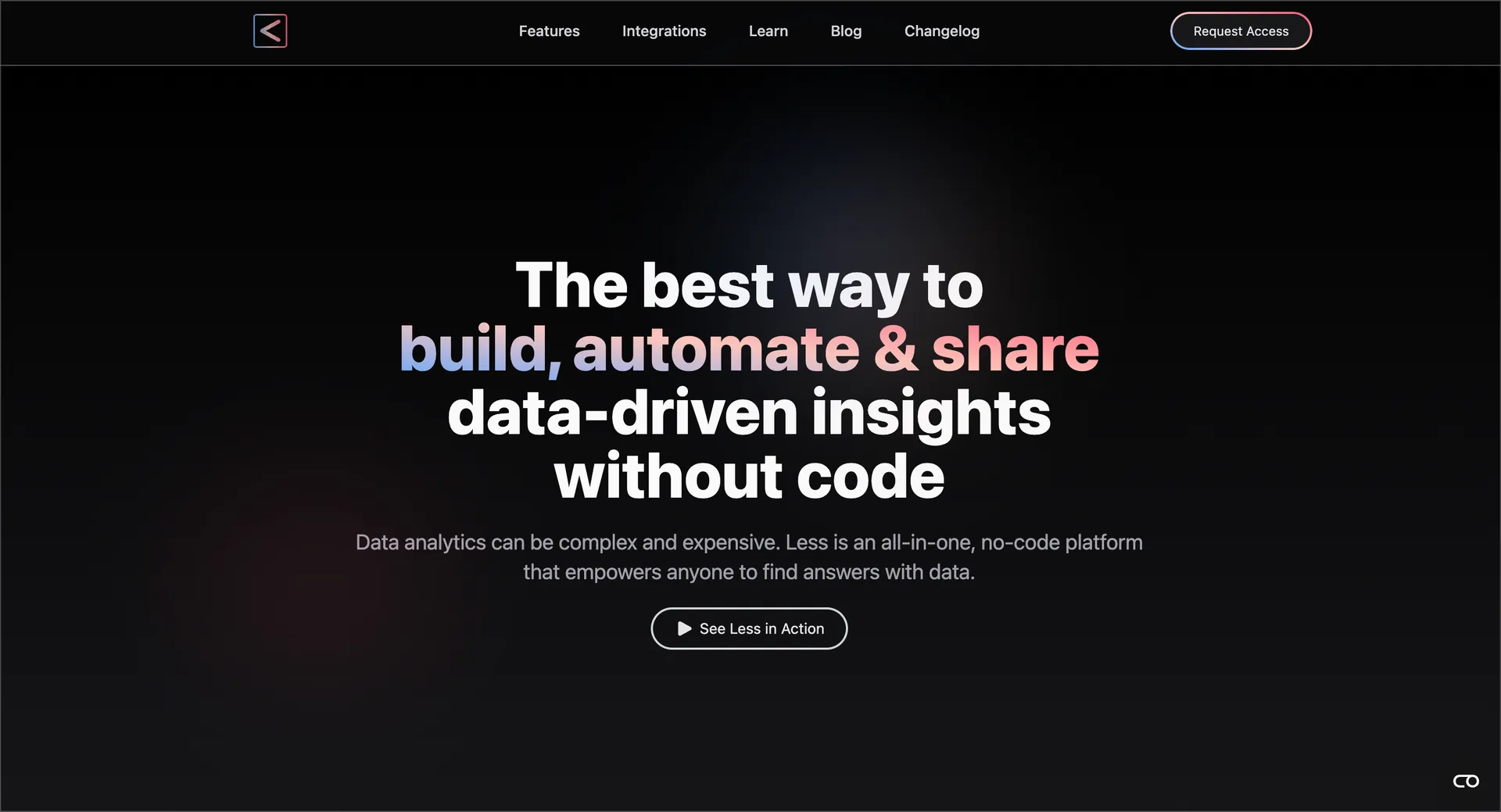
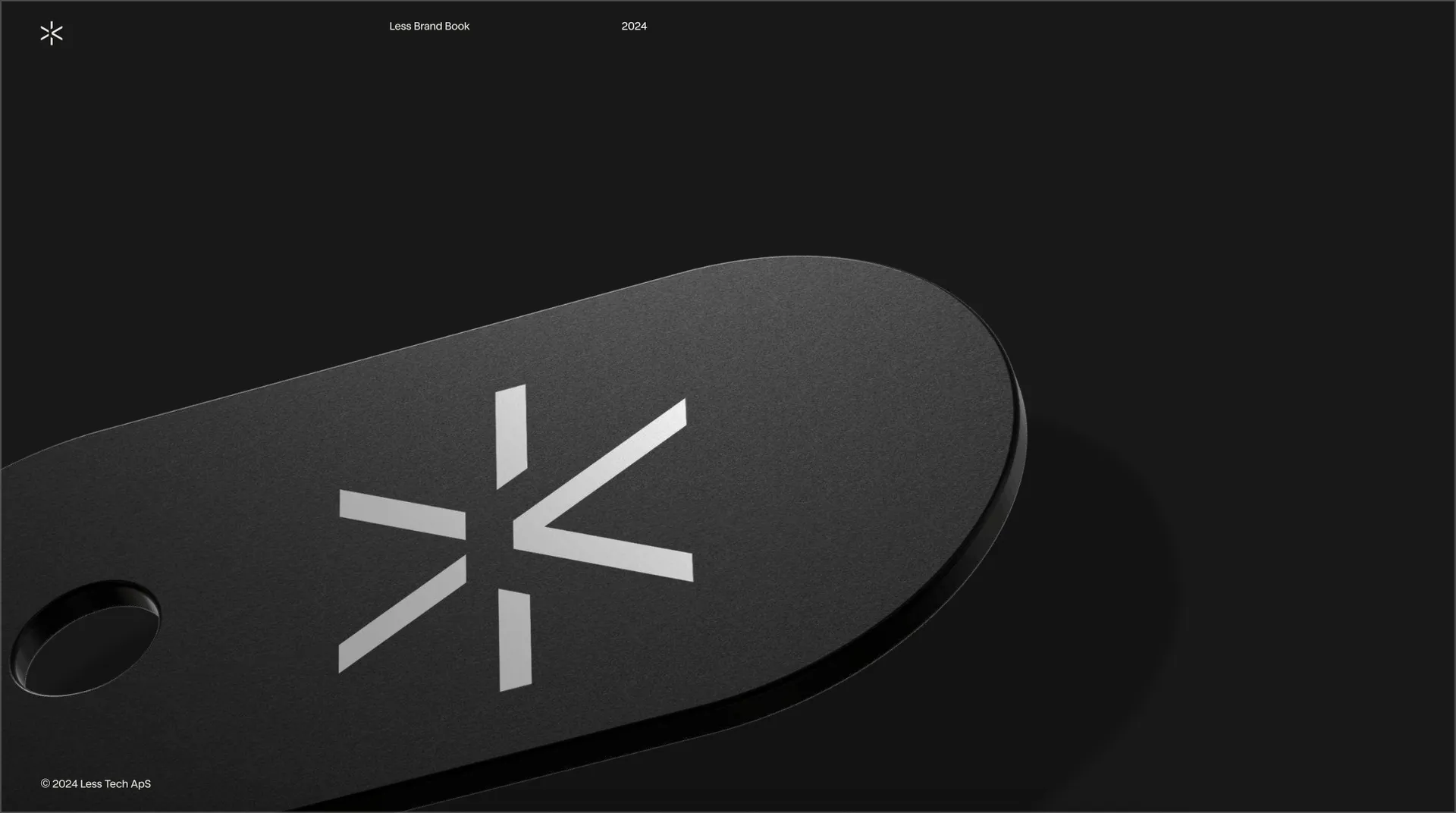
That is what we have been and are building Less to be. A new way of finding and discovering insights where people can focus on solving problems instead of spending time asking for permission and struggling in Excel. That sentiment is captured in our new logo - The Spark.
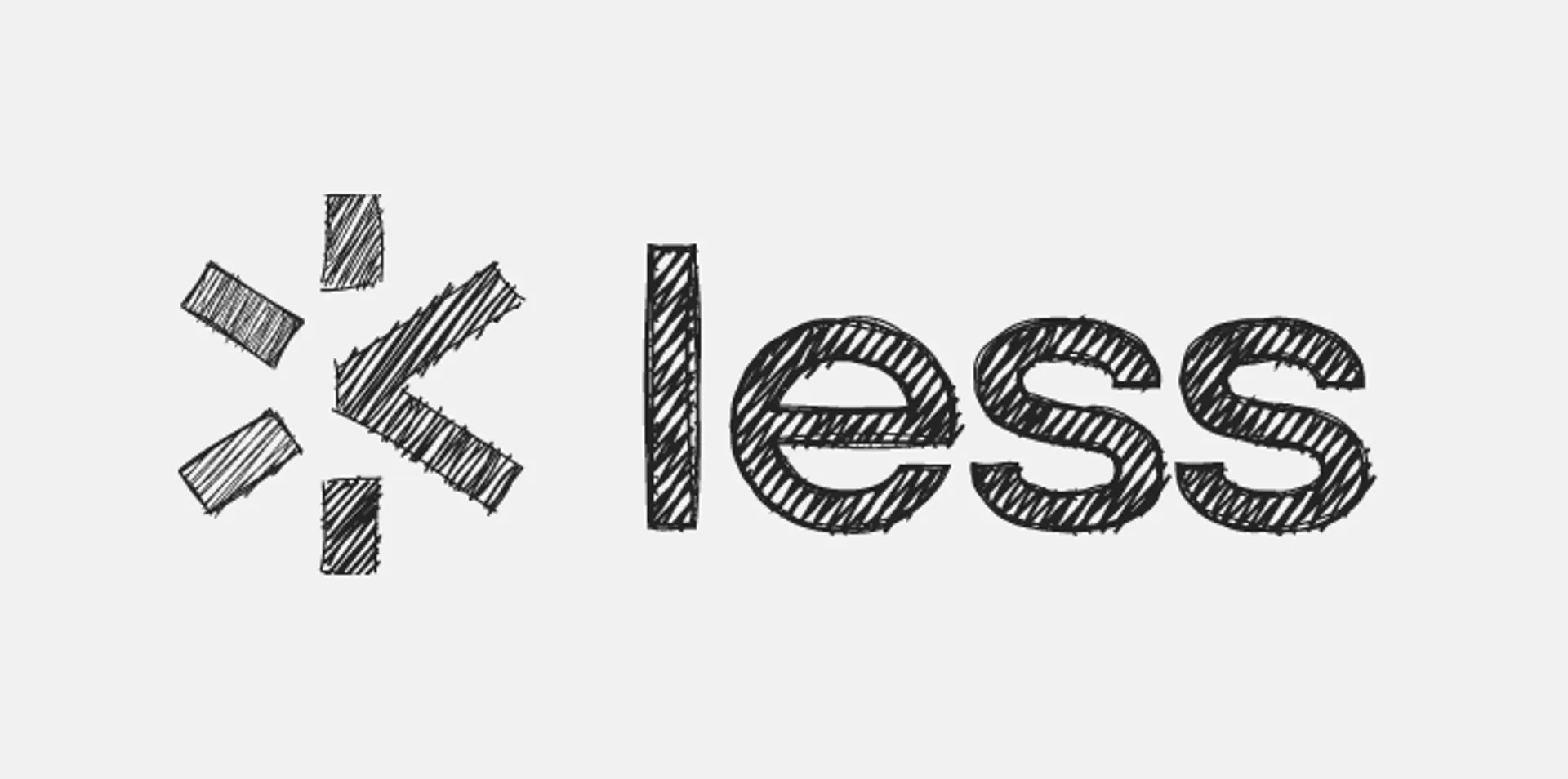
“The Spark” is more than just our logo—it’s what we stand for. It symbolizes how we enable doers to get going, like a spark igniting action. It also represents those moments of insight that lead to big ideas, all while reminding us of our goal to do more with less, as shown by the < symbol within it.
In short, all the pieces began to come together and we went full-throttle on implementation.
The new Less
Today we’re (finally) able to share the results with everyone.
We couldn’t have been happier with the our new brand. Now, we’re extremely excited about bringing the new visual identity into our application over the coming months.
For the curious, the website is built with the following tooling:
- Astro website
- Loops for email
- Tailwind styling
- React for interactive components
- GSAP for animations
- MDX for content
- Vercel for hosting